How to Choose the Right Business Chart

Author: Andrej Lapajne, Zebra BI, www.zebra.bi
A 3-step Tutorial
SUMMARY
There are 3 fundamental rules that you should always follow when deciding which chart to use. If you learn these 3 rules, there is a good chance that you will get it right no matter what the context of your data is.
1. Orientation
Will I display time-related data?
2. Task
What message do I want to deliver?
3. Shape
What type of data am I trying to visualize?
In this tutorial, we will explain each of these three steps in detail and illustrate them with practical examples.
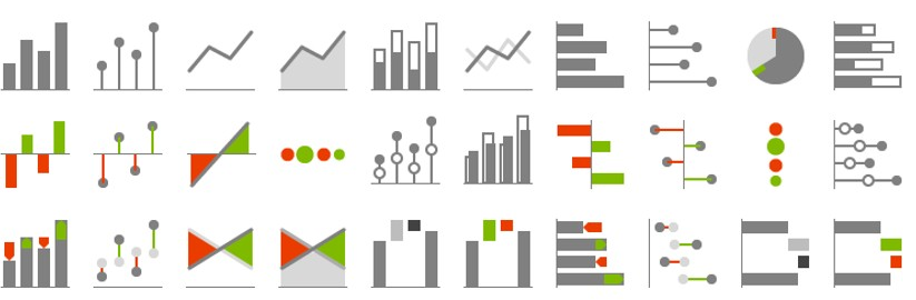
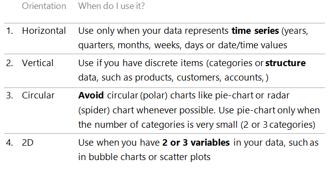
① Display time horizontally, category items vertically
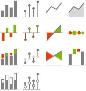
Let us focus on most frequent business charts, such as column and bar charts, line and area charts, dot plots or pin charts, plus-minus (variance) charts, etc. Your first decision should always be whether to turn them horizontally or vertically.
Here’s how you should make your decision:
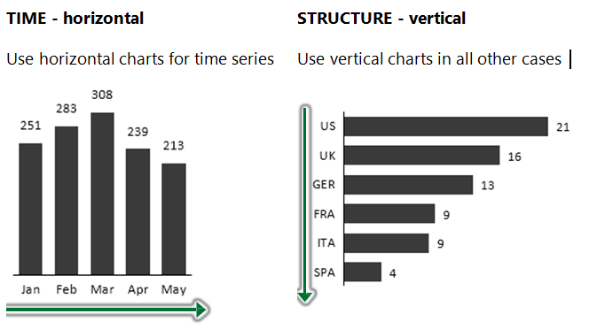
TIME – horizontal charts
 This means that your data categories are years, quarters, months, weeks, days or date/time values. That’s it. In charts, time should always run from left to right, never from top to bottom. It’s a simple convention that everybody understands.
Of course you can visualize other types of data categories with horizontal charts. But you will probably run into problems with labelling, category spacing, etc. If you really want to make an exception to this rule, do it only when the number of data categories is very small and their labels (names) are very short.
STRUCTURE – vertical charts
 When you have discrete items (categories or structure data like products, customers, accounts,…), use vertically oriented charts, such as vertical Bar chart, vertical Dot chart, vertical Waterfall chart or vertical Circle (Bubble) chart.
Vertical charts have two advantages over horizontal charts:
1. It is easier to display category labels
2. You can insert them into tables thus creating combined table-chart reports
Other chart orientations
Charts can also have circular (polar) orientation, such as pie chart or “spider” (radar) chart. On top of that we also have 2- or even 3- dimensional charts orthogonally oriented in two-dimensional space, for example scatter plots (XY charts) or bubble charts.
Here is a summary of all possible chart orientations and when to use them:
② Choose the right chart for your message
BI/reporting/visualization tools usually offer a large set of chart types to choose from. So it is utterly important that you understand and predict the nature of the analytical task that your readers will perform when observing your charts. You should always ask yourself: What message am I trying to convey?
For example, you might simply want to show an interesting trend over time. Or enable your readers to compare sales values of different products. Yet another time your readers will need to understand the variance to budget, growth from previous year values, contribution of specific products’ variance to the total variance, etc.
Here is our cheatsheet that will help you select the right chart for most common tasks that business users typically perform:
STRUCTURE ANALYSIS (CATEGORY COMPARISON)
Structure analysis is the most basic analytic task where the reader observes the displayed values and visually compares data categories to each other. These comparisons are usually of the following nature:
1. Looking up a specific value (e.g. finding the sales value of a specific product)
2. Comparing two values between each other
3. Ranking (trying to establish the sequential order of one or more data categories)
4. Recognizing patterns in the data (outliers or subsets of values with a specific pattern)
Whenever you display categories like this, think about the order of categories. For ranking, sort categories by value. In other cases order categories by their importance or perhaps a natural order like geography. Do not use alphabetical order – it works for phone books only …
TIME-SERIES (TREND) ANALYSIS
Time series (trend) analysis is a similar task to structure analysis but performed when the data categories represent time (years, quarters, months, weeks, days, timestamps).
Depending on the situation, the reader will perform the following types of comparisons within the displayed time series:
1. Looking up a specific value (e.g. the sales value of the last month)
2. Comparing two values between each other
3. Observing trends in the data (subsets of values with a specific pattern, e.g. linear growth or other type of seasonality)
PART-TO-WHOLE COMPARISON
Here users try to assess the relation of a part to the whole value (e.g. sales of one product to total sales of the company). The analysis exposes the “significance” of each part relative to the total value. Use stacked bar charts for part-whole comparison (and OK, pie charts as well, but only in very limited cases!):
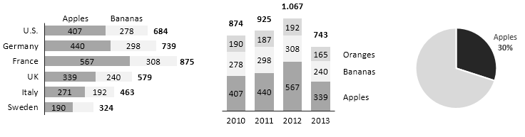
Avoid using pie charts altogether. They only work for very small number of categories (1-2). In fact, they actually work best when you only display 1 category compared to the whole (as in the example above). Guess what, it’s called the “pac-man” chart :-).
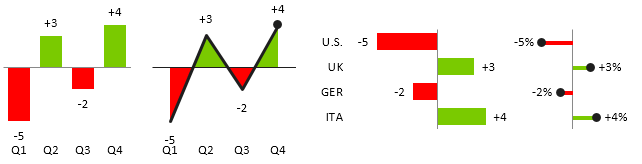
VARIANCE ANALYSIS
Variance analysis is the most fundamental task in business reporting. Understanding deviations from targets or budgets and growth rates from previous periods is a core requirement in almost any organisation. Use “plus-minus” charts to show variance over time or over structures:
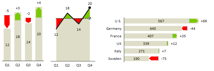
Use “integrated variance” charts to display actual values as well as deviations. Since both values (actual and deviation) are shown, the user can evaluate both the importance of each deviation (its magnitude) as well as its relative share of actual value at the same time:
CONTRIBUTION ANALYSIS
Contribution Analysis is a special type of part-to-whole analysis to assess the contribution of all parts to the whole value. There are two main versions of Contribution Analysis: (1) Contribution of variances and (2) Contribution of categories. Use waterfall chart for contribution analysis, it is simply perfect for showing explanations why a total value has changed. Here are 4 typical examples:
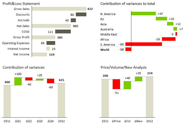
Waterfall chart is also called the “bridge” chart for obvious reasons.
CORRELATION ANALYSIS
Correlation analysis is used to assess whether two variables are correlated. It is also suitable for spotting outliers. Use scatter plot for correlation analysis:
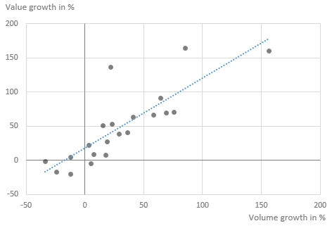
Warning: if two variables are in correlation, this does not necessarily mean that there is a cause & effect relationship between them!
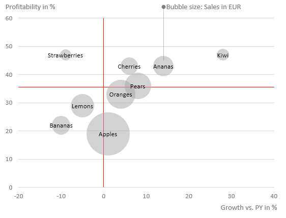
PORTFOLIO ANALYSIS
To analyse a portfolio of data categories (e.g. products, customers, suppliers, plants, etc.) by 3 variables, use the bubble chart:
③ Select the optimal chart shape for your data
Once you have determined the correct chart orientation and the intended task of your visualization, you are ready for your last major decision: which chart shape should I use?
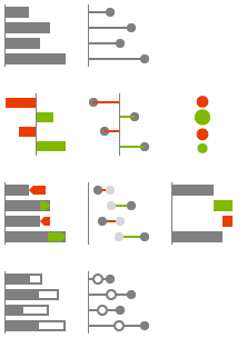
Instead of always just using the identically looking “default” column chart regardless of what it actually represents, you should use different chart shapes for different types of values (KPIs). This is called shape coding:
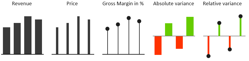
For example, the columns in the Price chart are much thinner than the ones in the Revenue chart. This is quite intuitive – revenue values are usually way bigger than prices since price is actually a ratio of revenue, divided by quantity (a value/volume division). Similarly you can use “pin” charts (yes, the “lollypops” ) for percentages since they are value/value or volume/volume divisions and are thus without any unit (just indexes, %). So it seems intuitive to use chart shapes without width for indexes in business reporting. Once readers understand this, they will instantly know what they are looking at, even without reading the labels. Especially in a repeating process, such as monthly reporting.
Similarly you can use patterns to code data scenarios like Actual, Budget, Forecast and Previous Year. For example, here is how budget values can look like:

Check out IBCS (International Business Communication Standards) for more great ideas like this.
Achieving consistency is business reporting is critical!
It is relatively easy to select the perfect chart shape when you only have one chart. That’s not rocket science and many researchers and authors have written guidelines on how to do this. But business reporting is so much more than just designing one single chart. In fact, most times you will have to use several charts at once to get the full message across to your readers.
Often you’ll need to design a report with many pages, a BI dashboard with several screens, etc. This is when consistency in your design becomes of utter importance.
Just as traffic signs consist of consistent colors and shapes that always mean the same thing, elements in business reports should be consistently designed to depict or “code” the same meaning with always the same shapes, colors, patterns, etc.
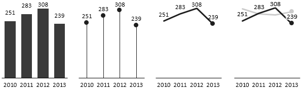
Emphasize single values or trend?
The shape of a chart itself determines what we will see and how we will interpret the numbers. Several “gestalt” laws govern our visual perception. That’s a fact. Different chart shapes will convey different messages to your audience.
For instance, some charts are more suitable for emphasizing single values, while others are better at displaying trends. Let’s illustrate this with the following examples:
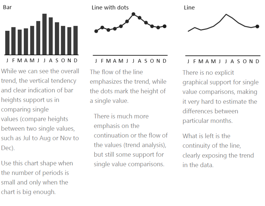
So, the perception of different chart shapes is clearly ordered from vertical bars (“columns”) to more “horizontally” oriented lines:

Still puzzled which shapes to use?
Here are two rules of a thumb:
1. Use chart shapes on the left when single values are important (e.g. annual or monthly figures) and when you expect that users will compare values between each other (e.g. current month to previous month). Also note that this is only meaningful when charts are big enough that you can comfortably display the columns and labels.
2. Use chart shapes on the right when you want the users to focus on overall trends. Also, choose line charts when you’re limited with space (e.g. small chart sizes, small category widths, …).
Just remember, before you click to insert your perfect chart, think about the 3 fundamental rules!
Original article is available here: http://zebra.bi/blog/2014/10/23/how-to-choose-the-right-chart/
 Andrej Lapajne je direktor poduzeća iStudio i osnivač produkta Zebra BI za profesionalno izvještavanje u alatu Excel. Kao konzultant ima 15 godina iskustva s uvođenjem menadžerskih izvještaja u farmaceutskim poduzećima, telekomima, maloprodaji, FMCG-u, proizvodnji, medijima, osiguranju, bankarstvu, energiji, javnoj upravi i high-tech industriji u Sloveniji i inozemstvu. Lapajne je Hichert Certified Consultant i osnivački član udruženja IBCS (International Business Reporting Standards). Studirao je informatiku, slikarstvo i kontroling. Predaje Information Design na Fakultetu za informatiku i Ekonomskom fakultetu u Ljubljani i vodi otvorene i in-house edukacije u Sloveniji i inozemstvu.
Kolumne