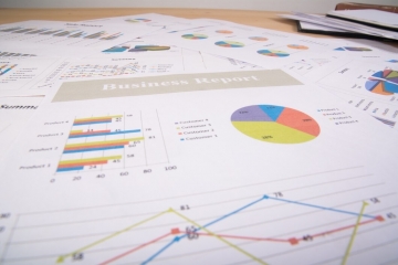
Advanced business charts with Excel

Seminar summary
Well-conceived visual design of data leads to better business communication: Information is conveyed to the target audience faster and more effective. The creators of reports are able to attract the desired level of attention.
This seminar provides a well-balanced combination of conceptional and technical methods needed to produce high-class business charts for reports and presentations. These methods and techniques are universally applicable and can be adopted to individual cases easily.
Who should participate
This seminar is geared towards all professionals involved in visualizing business data in reports and presentations. Many participants come from the fields of finance and controlling, sales, marketing, project management and consulting.
Important prerequisites
A basic understanding of the practical application of Excel is required to attend this seminar. Special knowledge, however, such as VBA is not necessary. We expect participants to have at least tried out the chart functions of Excel.
Excel 2013 is used in the seminar. Participants with Excel 2007 and 2010 will have no trouble understanding the steps. The training examples used in the course are provided in XLSX format for Excel versions 2007, 2010, and 2013.
Each participant should bring his or her own Windows-based notebook in which USB-stick access is not restricted. A mouse is recommended.
Program of the seminar
Registration
Overview of the HICHERT®SUCCESS concept
Successful business communication is based on binding rules: Say, Unify, Condense, Check, Express, Simplify, Structure
- Convey messages, use visualization
- Omit decorative and distracting elements
- Design charts and tables with standardized meaning
- Condense information, display scales accurately
Column chart with variance display, part 1
Excel charts need to be formatted and configured properly in order to comply with the SUCCESS-rules. Further features are implemented using some special tricks and techniques.
- Format standard charts according to the SUCCESS rules
- Position user-defined data labels and legends
- Display reference and separator lines
- Synchronize scales of groups of charts
Column chart with variance display, part 2
The methods are demonstrated and practiced using a column chart, as one of the most frequently used types. All techniques can also be universally applied to other chart types, though.
- Control chart elements through formula calculations
- Build a variance display with red/green columns
- Combine two charts in one using primary/secondary axes
- Switch column pattern for ACT/FC automatically
Combined charts, tables with variance display, PPT linking
Once created, chart templates can be used multiple times with little effort. They can even be combined to build more sophisticated multi-tier charts. All templates can be integrated into page layouts and linked to PowerPoint slides easily.
- Create combined charts by overlaying multiple templates
- Integrate charts into page layouts and link with PowerPoint slides
- Learn easy-to-use methods to enhance tables with red/green variance bars
Questions and answers
End of seminar
Language
The training will be conducted in English.
Ukoliko ste zainteresirani za otvorenu edukaciju ispunite dolje navedena polja kako bismo Vas mogli pravovremeno obavijestiti o terminu održavanja. Ukoliko Vas pak ima više od petero, u mogućnosti smo doći k Vama i organizirati in-house edukaciju na željenu temu. Odaberite područje Vašeg interesa i kliknite na gumb pošalji.

